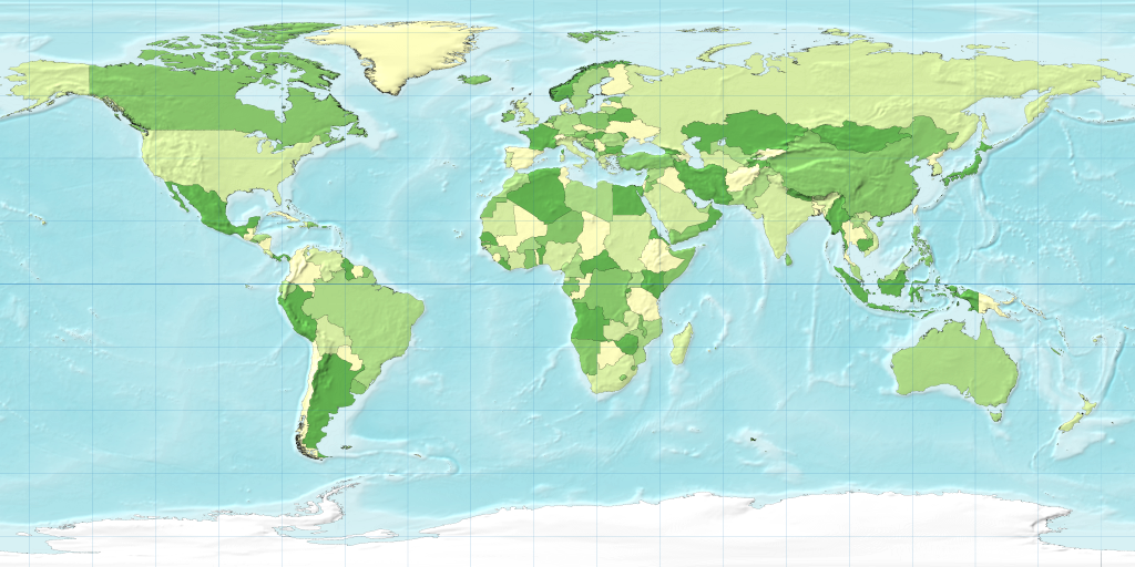
Roughly speaking, on a map like this, the sizes of the countries of the world are in proportion to their actual sizes on
the surface of the planet and their shapes are the same as their actual shapes. (This is only approximate though, since some
distortion is inevitable when you go from a spherical planet to a flat map.)
It's possible, however, and sometimes very useful, to redraw the map with the sizes of countries made bigger or smaller
in order to represent something of interest. Such maps are called cartograms and can be an effective and natural
way of portraying geographic or social data.
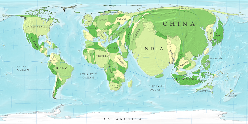
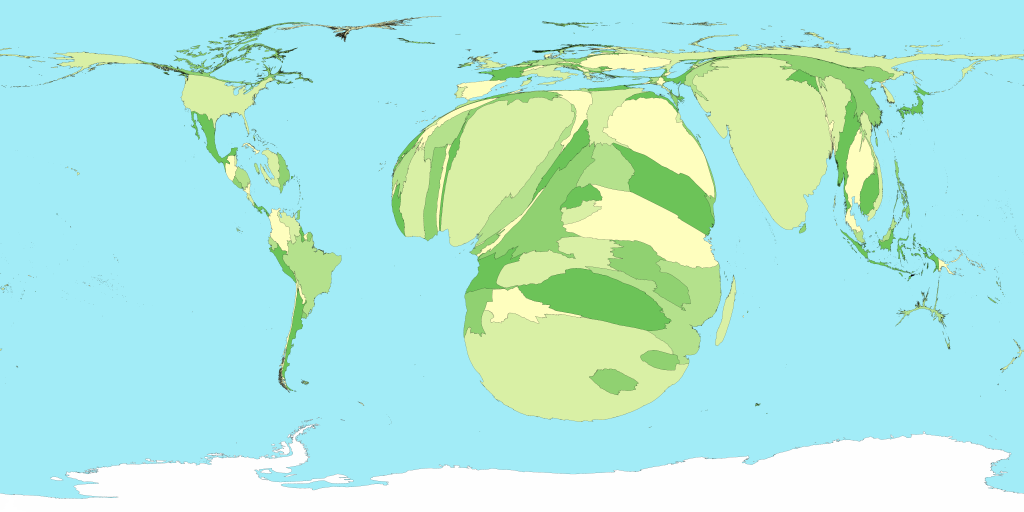
Here, for example, is a cartogram that shows the human population of the countries of the world:
Population
Click on image for a larger version
In this map the sizes of countries are proportional not to their actual landmass but instead to the number of people living
there; a country with 20 million people, for instance, appears twice as large as a country with 10 million.
Although the figures for populations of countries are well established and familiar to many, the cartogram provides a new
way of looking at them and in particular makes clear the enormous disparity in the population of different regions. Note how
large India and China have become: between them these two countries account for more than a third of the population of the
world. On the other hand, notice the near-disappearance of Canada and Russia, the world's two largest countries by land area,
which have relatively few people in them.
Notice also how the lines of latitude and longitude have become distorted by the growing and shrinking countries. This
is an unavoidable consequence of the cartogram transformation: in order to give the countries the right sizes and still have
them fit together you need to warp things a bit. The method used here, however, does a pretty good job of keeping the map
recognizable.
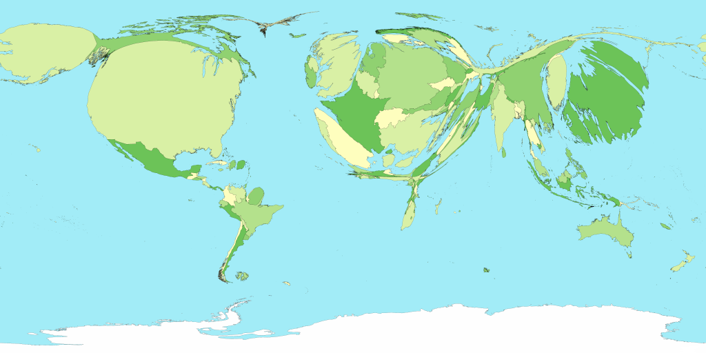
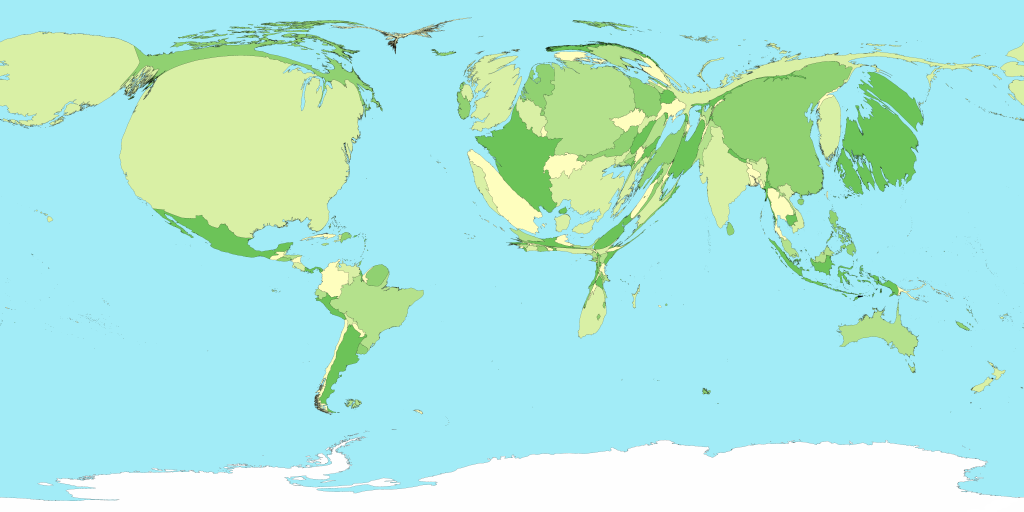
Cartograms are most often used to show population data, but there is no reason why they need be limited to population.
They can in principle be used to show almost any quantity. Here is a cartogram of the world in which the sizes of countries
are proportional to Gross Domestic Product, which is a measure of how much wealth a country's economy generates, and hence,
to an extent, of the wealth of the country's inhabitants:
Gross domestic product
Click on image for a larger version
Notice how America and Europe dominate this map, along with Japan (yes – that huge dark-green island on the right
really is Japan), while Africa dwindles almost to invisiblity.
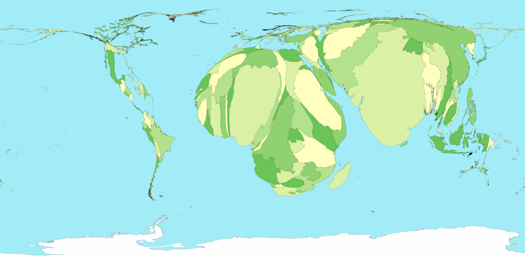
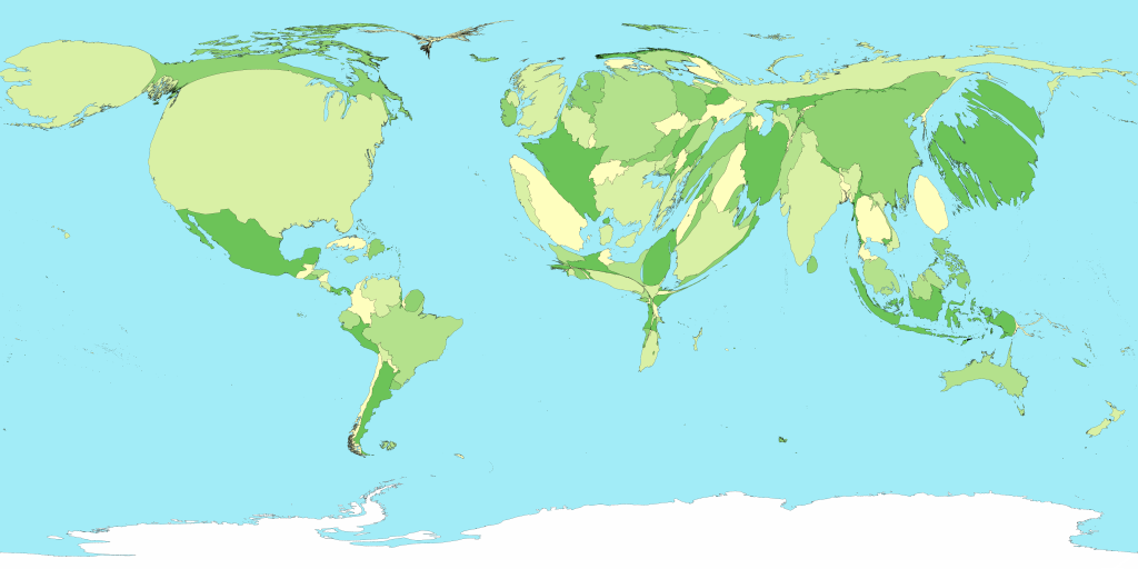
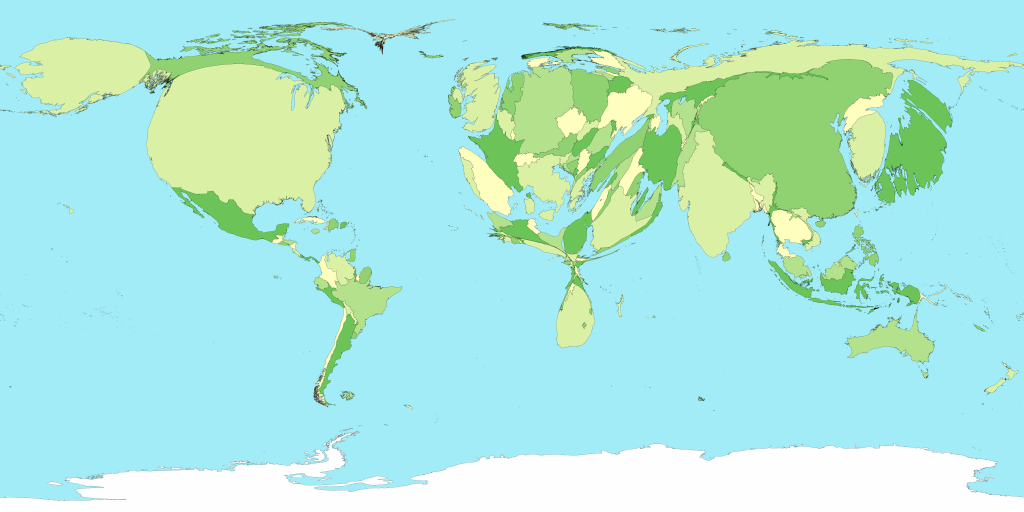
Now here are a few more cartograms. In all of the maps on this page the countries have the same colors, which helps to
identify countries in the cases where shapes have changed a lot.
Child mortality
Click on image for a larger version
People living with HIV/AIDS
Click on image for a larger version
Total spending on healthcare
Click on image for a larger version
Energy consumption (including oil)
Click on image for a larger version
Greenhouse gas emissions
Click on image for a larger version
If you are interested to see more cartograms, you might like to visit the website of the Worldmapper Project, where a group of colleagues and I are gathering together an ever-growing collection of cartograms showing all sorts of aspects
of the social, economic, and geographic world. The web site contains, among other things, downloadable posters of cartograms
that you can print out, along with data sets, descriptions of the statistical analyses, and information about the methods
used to produce the maps. (The maps shown here were made specially for this page and are not part of the Worldmapper Project,
but there are similar maps on the project web site.)
Technical details: These cartograms were created using a variant of the diffusion algorithm of Gastner and Newman. Data for the population cartogram were taken from the Gridded Population of the World compiled by the International Center for Earth Science at Columbia University; elevation and bathymetric data were taken
from the NOAA 2-minute Gridded Global Relief data set. Data for the other cartograms came from the United Nations Statistics Division and from the databases of the World Health Organization. In all of the cartograms on this page, Antarctica has been treated the same as the sea, meaning its area is unchanged although
its shape may be distorted slightly to make room for changes in the sizes of other parts of the world.
Permission is hereby granted for the use and distribution by others of the text and figures on this page for noncommercial
purposes. Go ahead and send them to your friends, post them on your blog, use them in school. Whatever. My only request is
that you either give a link to this page or just mention that the maps were made by me. (Or both, if you're feeling particularly
enthusiastic.) If you would like to use any of these materials for commercial purposes, please drop me a line. Contact details
are here.
If you spot any errors in the text or figures, the author would very much appreciate hearing about it. Again, contact details
are here.
High-resolution versions of the figures are available on request from the author.
My computer software for producing cartograms is freely available here. A number of other programs implementing the cartogram algorithm of Gastner and Newman are also available. See here, here, and here.
The views expressed on this web page are personal and are not necessarily shared by the University of Michigan.
Mark Newman, Department of Physics and Center for the Study of Complex Systems, University of Michigan Email: mejn@umich.edu Updated:
February 16, 2006